Founded in 2004, Staycity Group had grown from one apartment in Dublin to more than 30 aparthotels across Europe, split between the original brand and their newer sister, Wilde. We worked with them to develop two separate brand identities, one as a refresh of the staycity look and feel, and a completely new visual and vocal identity for Wilde.
Marking a separation from the masterbrand, the visual identity and TOV are inspired by the wit and wisdom of the brand’s namesake. Part of the Aesthetic Movement, Oscar Wilde obsessively searched for beauty, something we wanted to encourage for guests, to help them experience the best of each city.
The new identity and logo directly references Oscar Wilde’s flamboyance and wit, inviting the guests to see the city through a different lens, where beauty lies in the unexpected details and small moments.
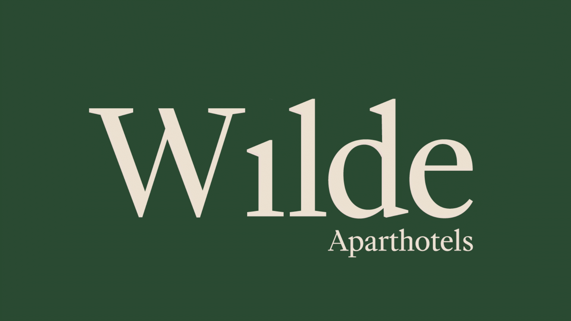
This care for details translates to the new logo, which pairs the elegant serif typeface Mediaan with a bespoke hand drawn tittle (dot of the i). Thought as a viewfinder, the tittle becomes a cartouche at smaller sizes, holding the logo in a tight stamp-like composition.
The identity relies on a tone of voice imbued with dry wit and humour, emulating Oscar Wilde’s mastery of the English language. Across the assets, the copy is punctuated with hand made marks, bringing the text to life in a nod to the act of writing and drafting.The new Wilde brand employs artful photography, sharp copy, a muted colour palette, and witty illustration to embody the spirit of a modern-day aesthete.
To officially launch the brand, we created a manifesto film, celebrating moments of everyday aestheticism. Shot entirely in camera, key words and phrases from the launch manifesto were made and captured in everyday situations, from handpainted signs to embossed books and panniers, postcards to graffiti.
The film garnered 14m views on social channels, in the first month, predominately youtube and tiktok.


.jpg)
.jpg)
