By Department of Creativity (D.O.C)
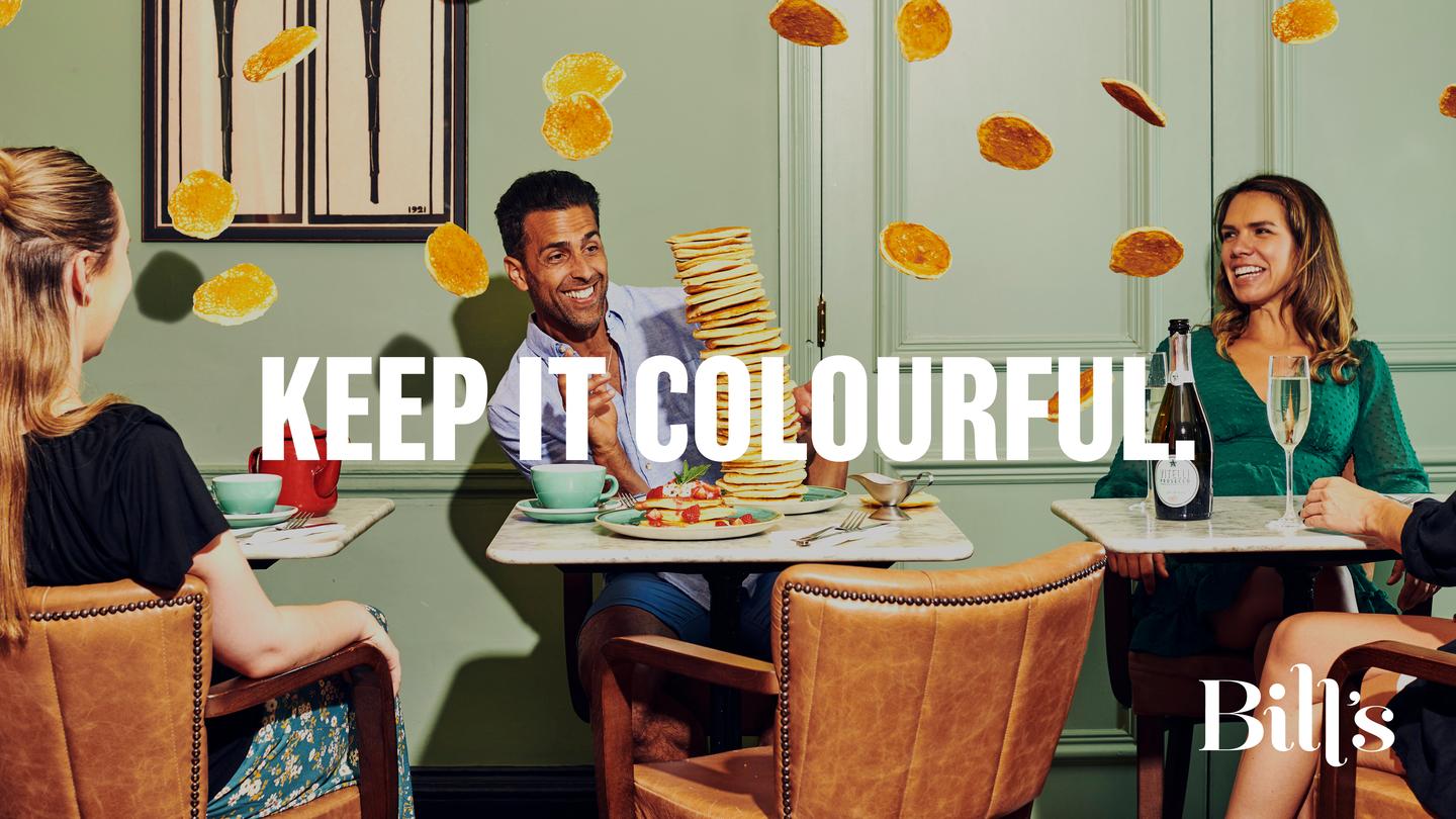
Bill’s. Keep it Colourful.
brand positioning | brand identity | strapline | TOV | copywriting | design | promo campaign | website
‘to be renowned for bringing as much colour to the world as we do to our plates’
Bill’s has been a mainstay of the British dining scene for over two decades, with 61 restaurants across the UK.
So when the Bill’s brand team asked us to create a new identity for their long-established brand, we knew we had quite a challenge to get our teeth into (sorry). We gave the brand a complete overhaul through positioning, belief, strapline, colour palette, design, tone of voice, photography, menus, website… the list goes on.
Naturally, it required a fair few team site visits, big breakfasts and bottomless pancake stacks to thoroughly understand the brand. All in the name of research of course.
--------
Restaurant Marketing & Innovator Awards x2:
Brand Identity 2024 & Best Website 2024
First Qtr from launch: footfall +11.14% | Email +24.34% | Conversion rate at +15.59%